NEW CITY
Logo & Brand Identity
A case study on a brand update and redesign
The Story
New City Fellowship, a church plant in Orlando, Florida, already had an established logo and brand system. Inspired by the Orlando city skyline and roots to reflect the concept of planting a church and rooting the city in the gospel, their logo and brand system were functional and useful, and told the story of the church, but lacked memorability and contrast that facilitate visual appeal.
New City wanted a modern, high-impact brand identity to better reflect its dynamic community, particularly its prominent young adult and family audience. The goal? A bold, fresh aesthetic that stands out across digital and physical spaces, making an immediate and lasting impression.


The original logo and design system
Challenge

Early drafts of the Above logo & design system
The church’s previous navy blue and gold branding, while classic, didn’t fully capture the energy, diversity, and contemporary spirit of the congregation. It needed a revamp—one that felt more vibrant, more engaging, and more adaptable across all platforms.
While the goal of the project was to establish a bold and fresh aesthetic, the aim was also to assure that the new refresh stayed faithful to the spirit of its original version, and managed to appeal to a wide and diverse audience; speaking to the mission of the church plant to be a welcoming place for people of all ages.
The Solution
Enter the black and yellow refresh—a fearless, high-contrast identity that radiates energy and confidence. This update moves away from the muted elegance of the past and embraces a clean but bold, urban, and lively aesthetic, ensuring New City Fellowship’s presence is unmissable and visually appealing, while catering to a diverse audience.


Design Approach
Striking Black & Yellow Palette
A bold color shift that commands attention, enhances visibility through more eye-catching contrast, and adds a fresh edge to the brand while increasing livelihood and readability.
Before
After
Stronger Typography
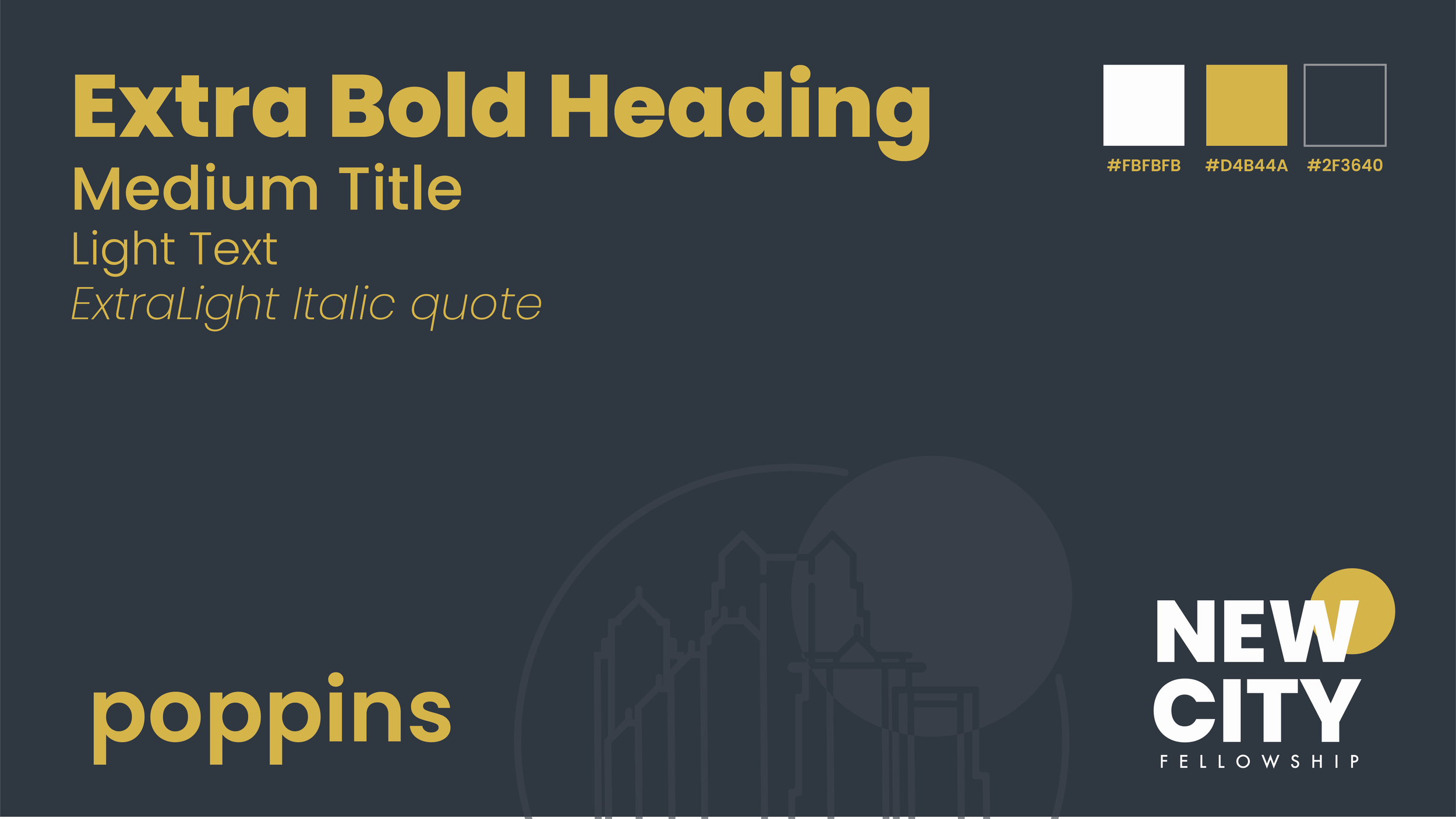
Clean, modern typeface families that are more versatile, exude confidence and are optimized for both print and digital impact.

Blending Sans & Serif to Tell a Story
A thoughtful combination of a serif font, representing the history and permanence of the biblical church, with sleek Druk sans serifs that introduce a contemporary feel—adding versatility, visually blending the old and new in a compelling way, and speaking to the ancient origins, current permanence, and modern future of the church.

Streamlined Logo
Simplified for maximum clarity and versatility, the redesigned logo makes the church’s identity instantly recognizable across all touchpoints and allows for more visual clarity and adaptability in a wide range of sizes and applications.


After
Before

Execution
The revitalized branding was rolled out across:
More cohesive social media graphics that pop with energy
Digital and print materials that feel fresh and modern
Website and marketing visuals that enhance engagement
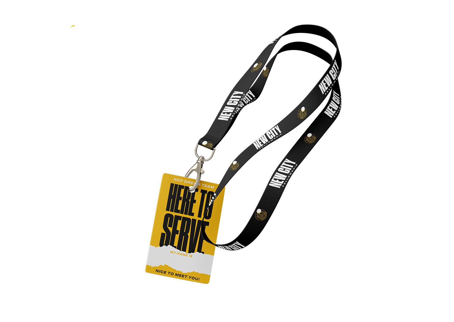
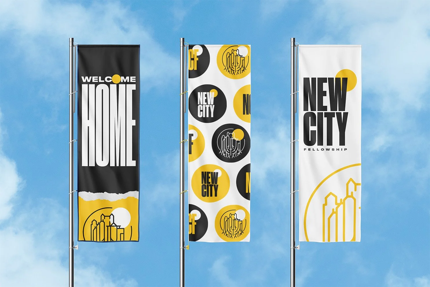
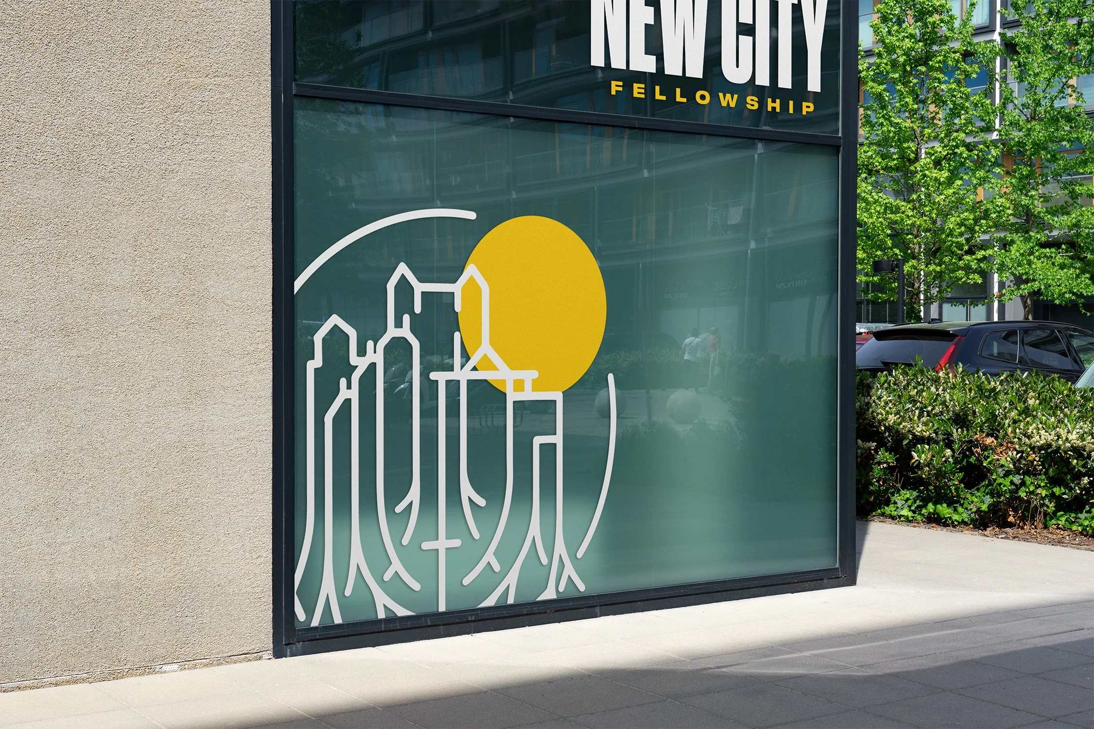
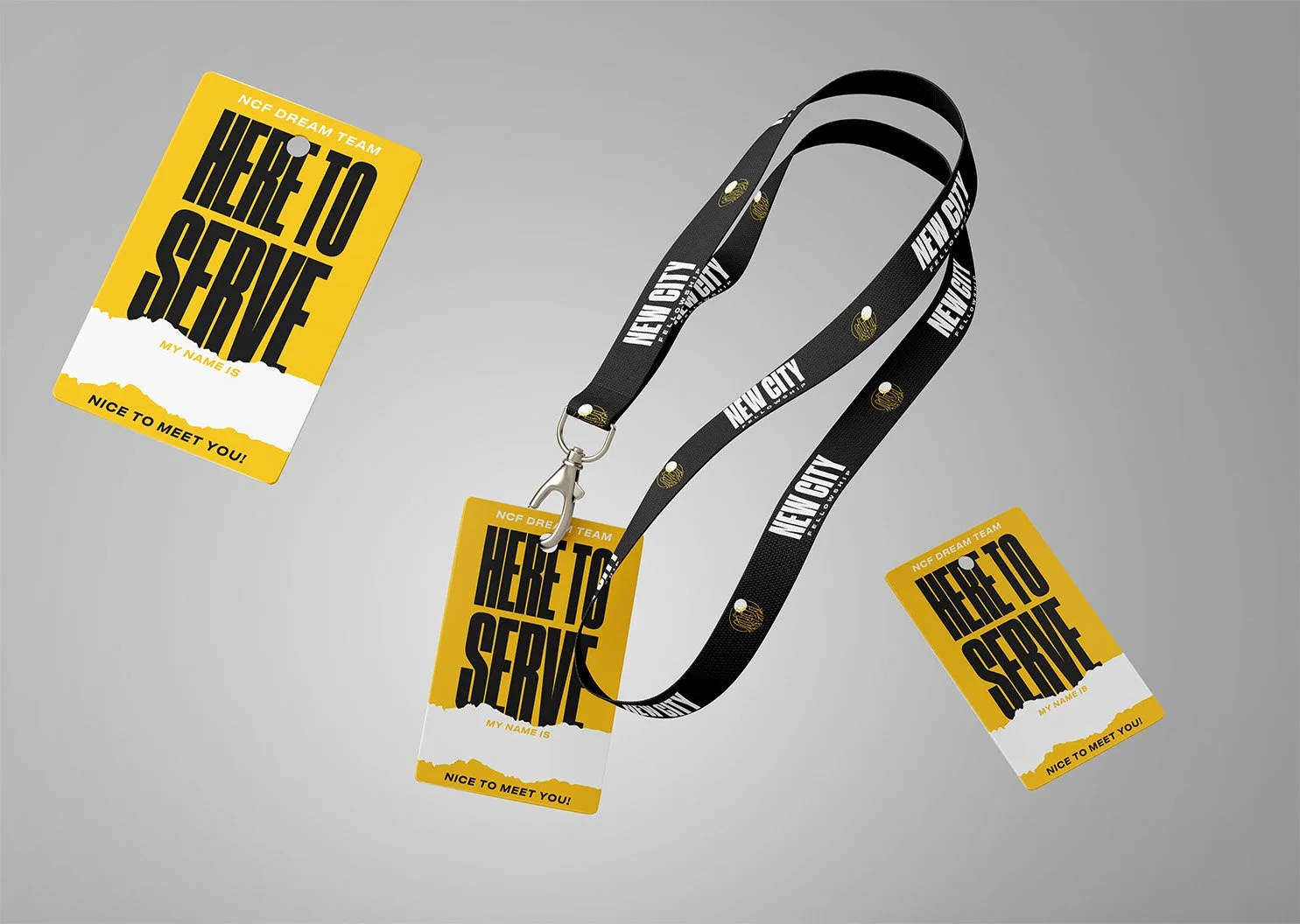
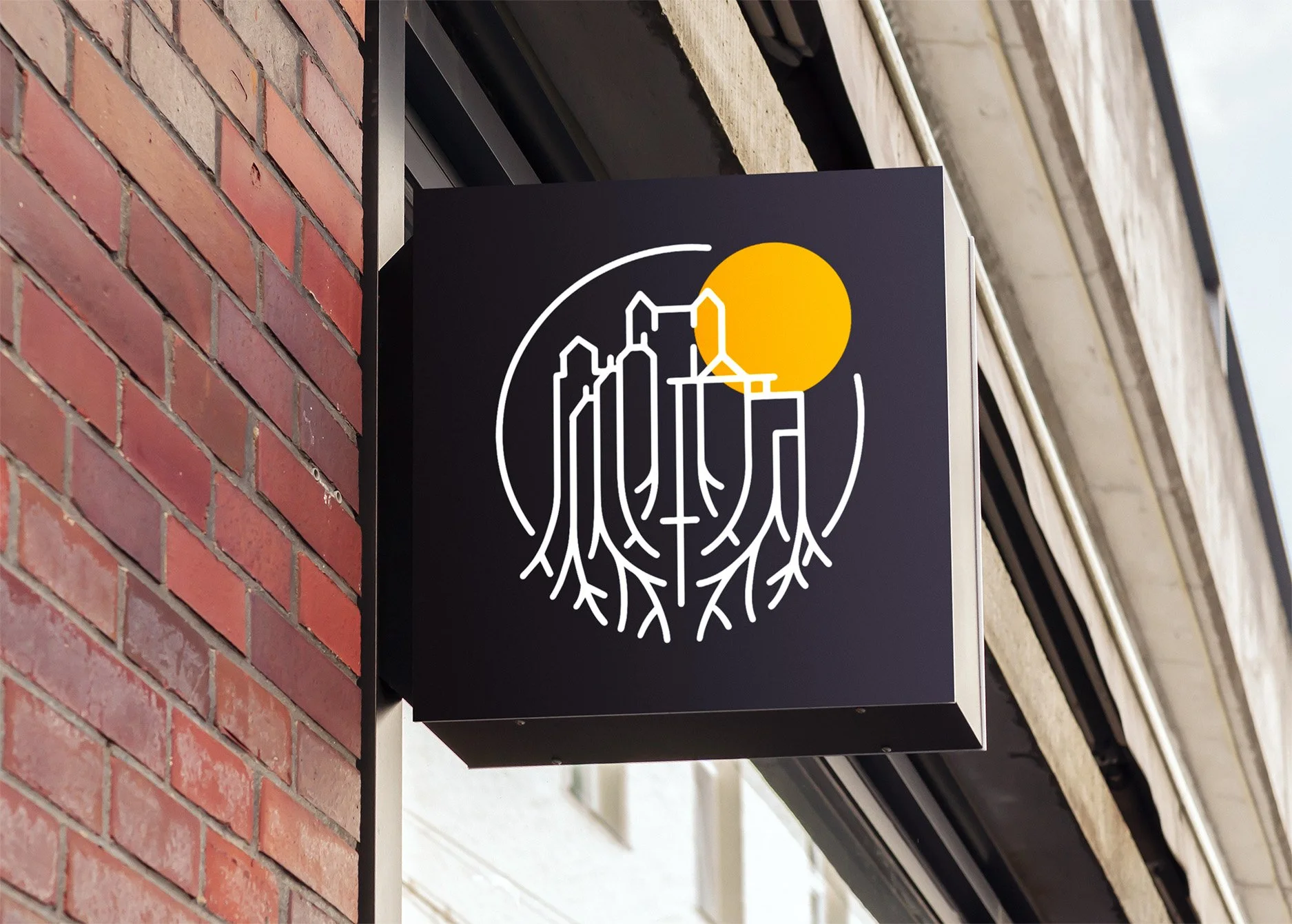
Church signage and merchandise that unify the brand experience






Impact
With its new identity, New City had a visual brand language that matches the energy and vision of New City Fellowship. The refreshed update resulted in increased engagement with the brand on social media, an increase in excitement amongst the staff and members of the church, and the development of a consistent and more defined design language that can more easily be communicated, identified, and maintained due to stronger brand recognition. This wasn’t just a design update—it was a fresh start.

