

GATHER
Logo & Brand Identity
A case study on creating a memorable and versatile brand identity
The Story
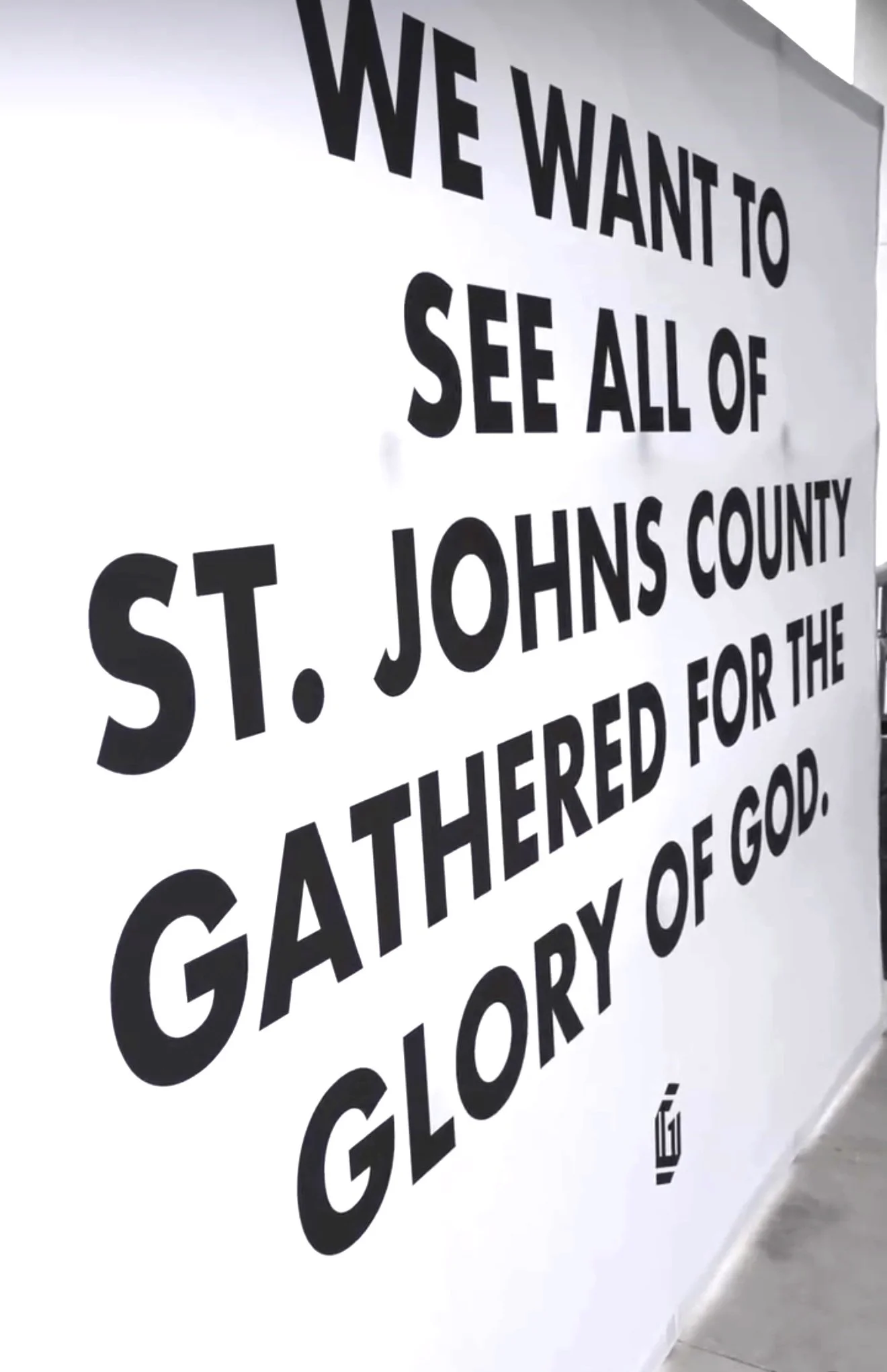
Gather Church, a new church plant in St. John’s County, Florida, sought to create more than just a place of worship—it aimed to build a movement centered on faith, unity, and belonging. To bring this vision to life, the church needed a modern, versatile brand identity that would appeal to a diverse audience while standing out in both digital and physical spaces.
Challenge
One of the biggest challenges in designing the brand identity was avoiding stereotypical imagery often associated with the word "Gather". Traditional visual representations—such as wheat, hands joining, or a group of people—risked feeling overused, predictable, or limiting. Instead, the goal was to evoke the spirit of gathering—connection, strength, and shared purpose—without relying on literal symbols.
The identity also needed to be:
Memorable & Simple: Easily recognizable yet distinctive.
Versatile & Scalable: Effective across digital, print, signage, and apparel.
Modern & Truly Timeless: Contemporary enough to engage younger generations while remaining welcoming to all.

Early drafts of the proposed logo
The Solution
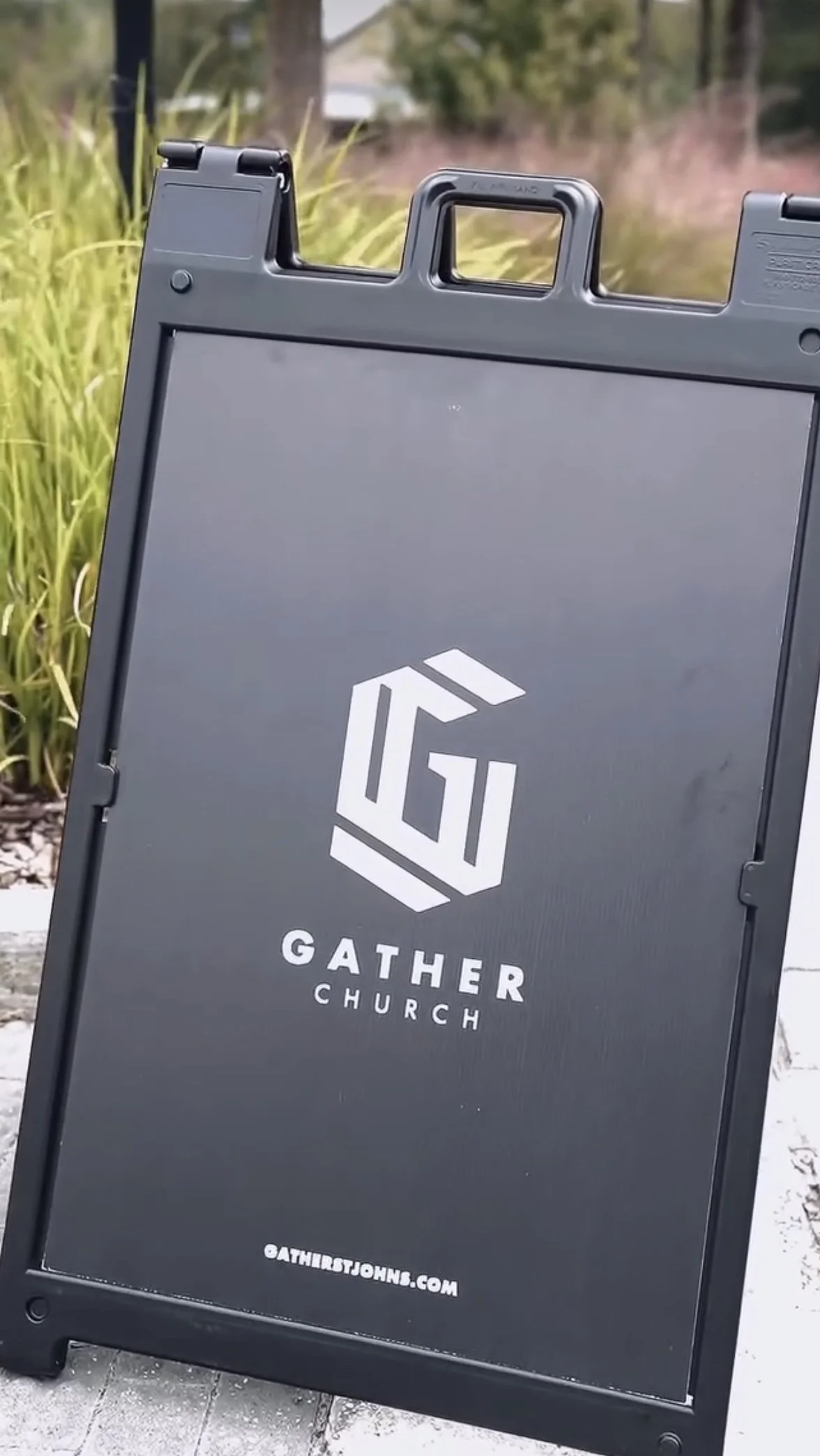
The solution was a bold, geometric monogram "G", designed to encapsulate the essence of unity, faith, and movement in a fresh, unexpected way. Instead of relying on conventional gathering symbols, the mark embraces strong, interwoven and connected letterforms and shapes, symbolizing:
Connection & Strength – A structure that suggests people coming together in a purposeful way.
Modern Minimalism – Clean, angular lines give it a contemporary feel without unnecessary complexity.
Enduring Adaptability – A black-and-white palette ensures high contrast, flexibility, and timeless appeal.
The wordmark complements the monogram with a clean, confident sans-serif typeface, reinforcing the church’s forward-thinking mission.

‘G’
Dynamic + symmetrical stripes
Geometric shapes
Design Approach
Abstract Symbolism Over Literal Imagery
Instead of cliché representations, we designed a mark that subtly conveys the strength of gathering through geometric form. Subtle G’s within others allude to the spirit of unity and gathering, without putting the imagery at risk for being too obvious or boxed within a stereotype.

Bold, Minimalist Aesthetic
A strong visual presence ensures adaptability while maintaining clarity. The folded ribbon-like quality of the logo brings movement and allows the logo to be dynamic, while not sacrificing simplicity, legibility, or visual ease.

The design avoids unnecessary complexity, ensuring it remains impactful across all mediums. Using a color scheme comprised of black, white, and a neutral warm grey, the color scheme for Gather allows for more versatility, a modern aesthetic, and a clean presentation that can be easily adapted to meet the visual needs of the church and it’s various ministries.
Intentional Simplicity

Execution
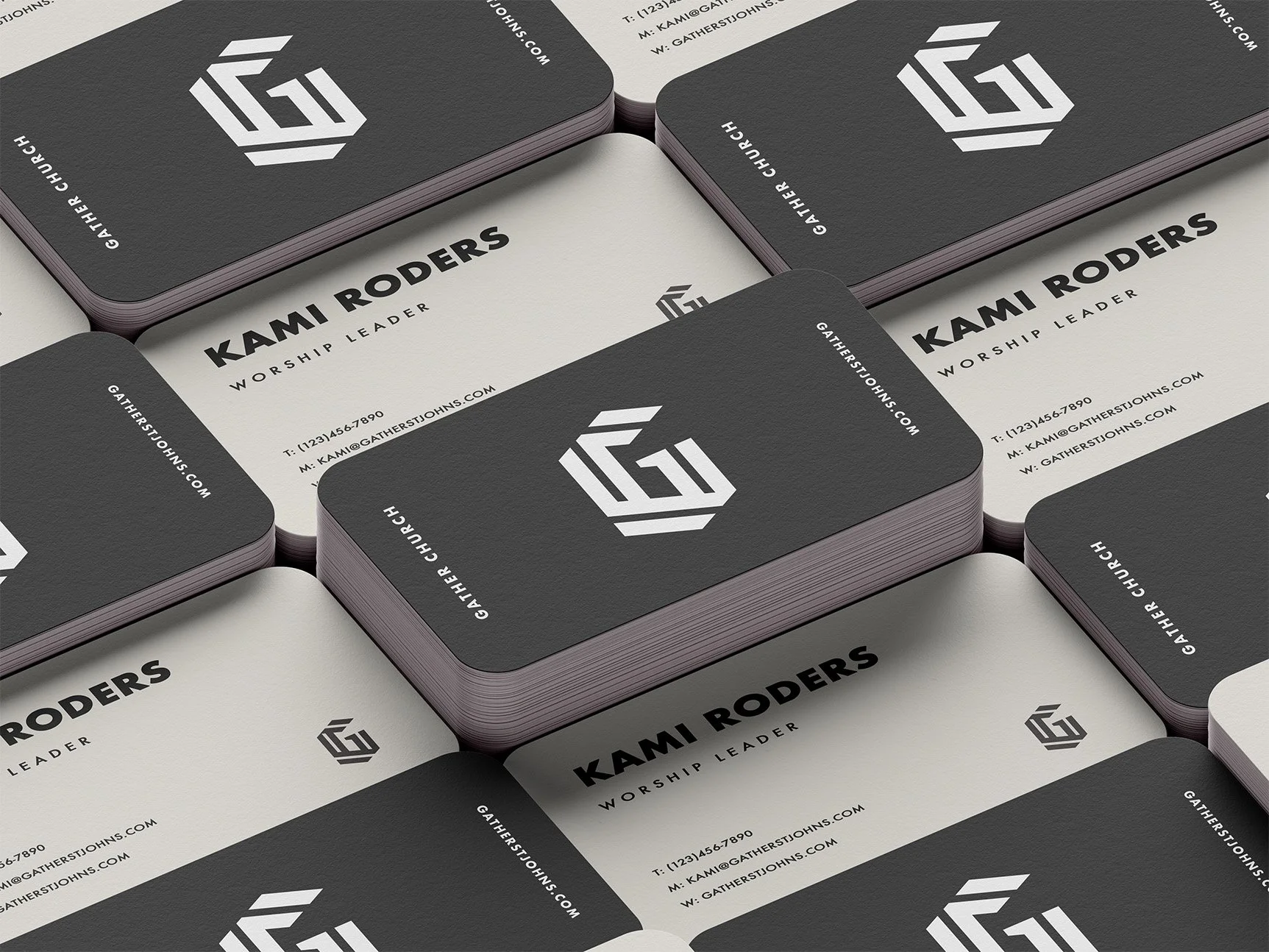
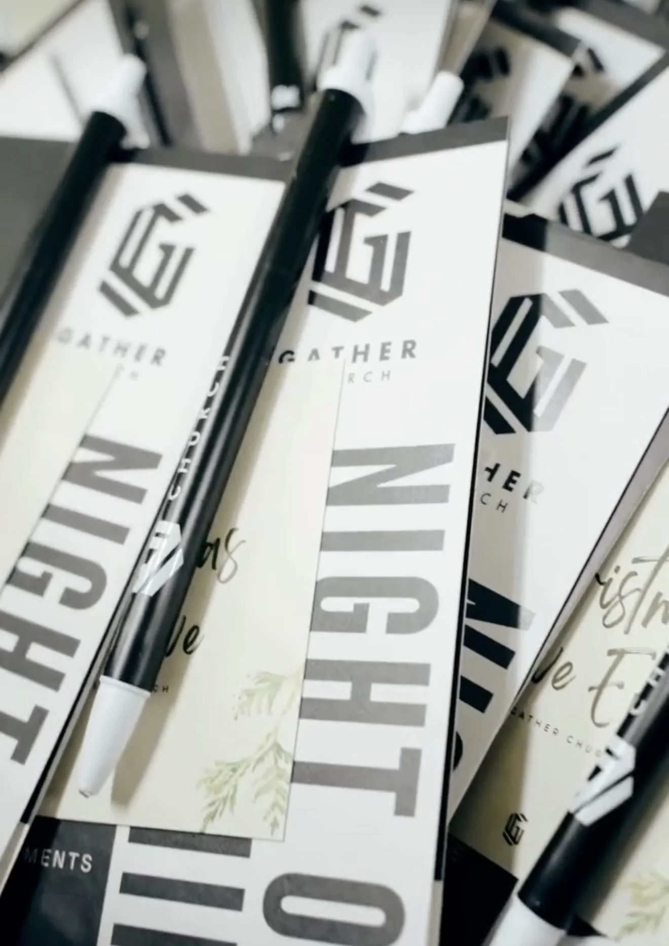
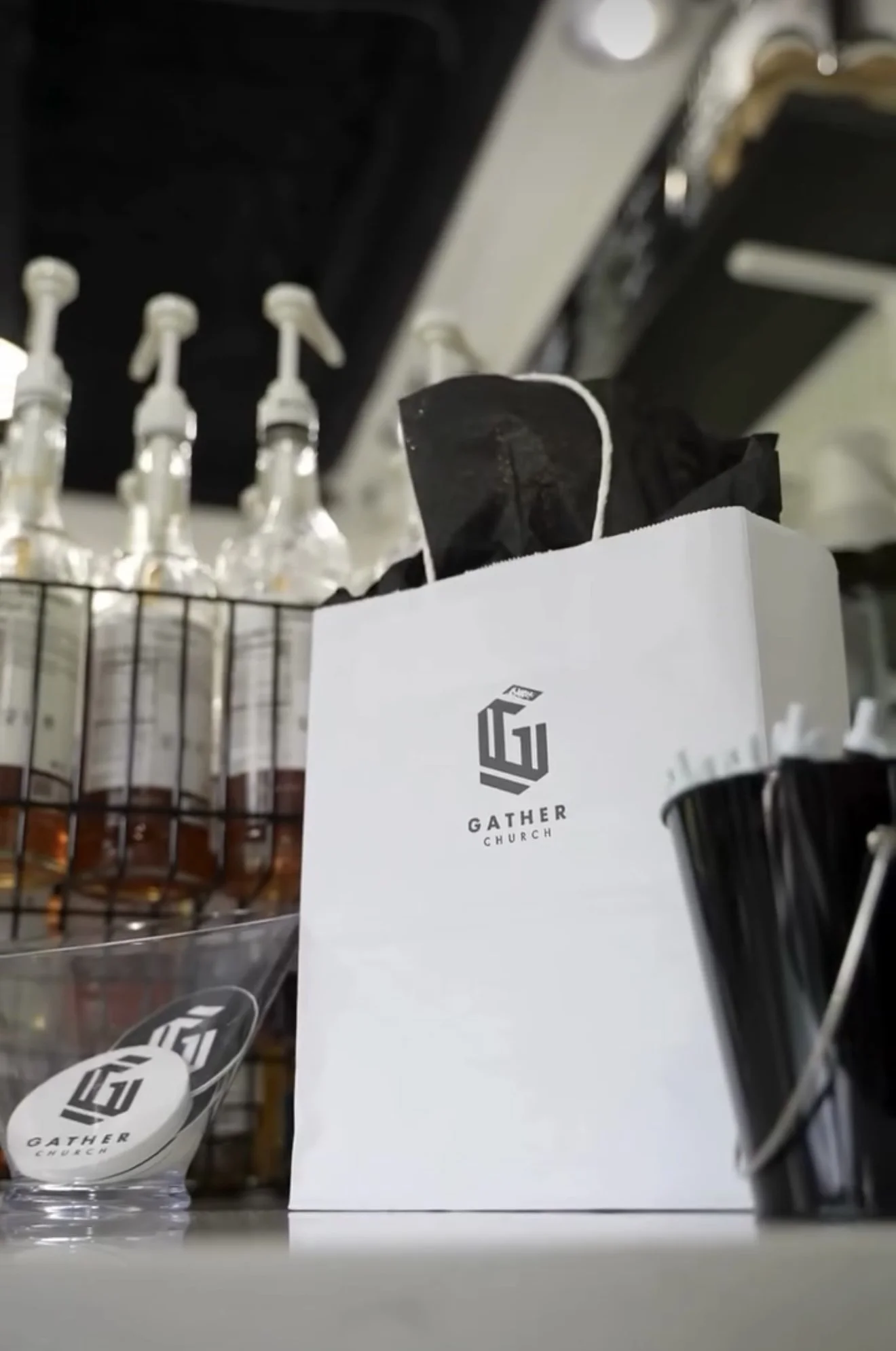
The final brand system includes:
Primary Logo: A stylized "G" monogram, subtly reflecting themes of gathering without being literal.
Wordmark Version: "Gather Church" in bold, modern typography, enhancing clarity and presence.
Flexible Design: Created to work across digital content, merchandise, signage, and social media—ensuring a seamless, impactful brand experience.


Impact
This brand identity does more than just look good—it embodies the church’s mission of gathering in faith without visual clichés. The modern yet timeless design allows Gather Church to:
Stand out with a unique, sophisticated aesthetic.
Connect with a broad audience through meaningful simplicity.
Communicate its vision clearly and consistently.