LCF

Logo & Brand Identity
A case study on creating a memorable and dynamic brand identity
The Story

The balcony of the founder’s grandmother’s home in Puerto Rico
Some brands are built on strategy. Others are built on soul. Latin Candy Factory is both. Inspired by the founder’s entrepreneurial grandmother, who once sold sweets from the balcony of her humble Puerto Rican home, this candy company needed more than just a logo — it needed a visual identity that told a story. A story rooted in Latin tradition, childhood nostalgia, and vibrant joy — but made for a broad, modern audience across the U.S.
Inspired by trips back to her native Puerto Rico and her grandmother’s entrepreneurial spirit, the founder of Latin Candy Factory wanted to create a modern candy shop for a growing Latin-American population in the United States with homesick nostalgia; delivering bite-sized memories -not readily accessible in the United States- from their homelands to their front door.
Challenge

How do you bottle the feeling of being a kid in your abuela’s kitchen and turn it into a brand that resonates with people from dozens of Latin American backgrounds?
The ask:
Celebrate the founder’s Puerto Rican roots — without being limited to one culture
Create a brand identity that feels nostalgic, playful, and uniquely Latin-American, but approachable to a diverse audience
Design a system that is colorful without being loud, versatile across platforms, and instantly recognizable
Moodboard & Inspiration



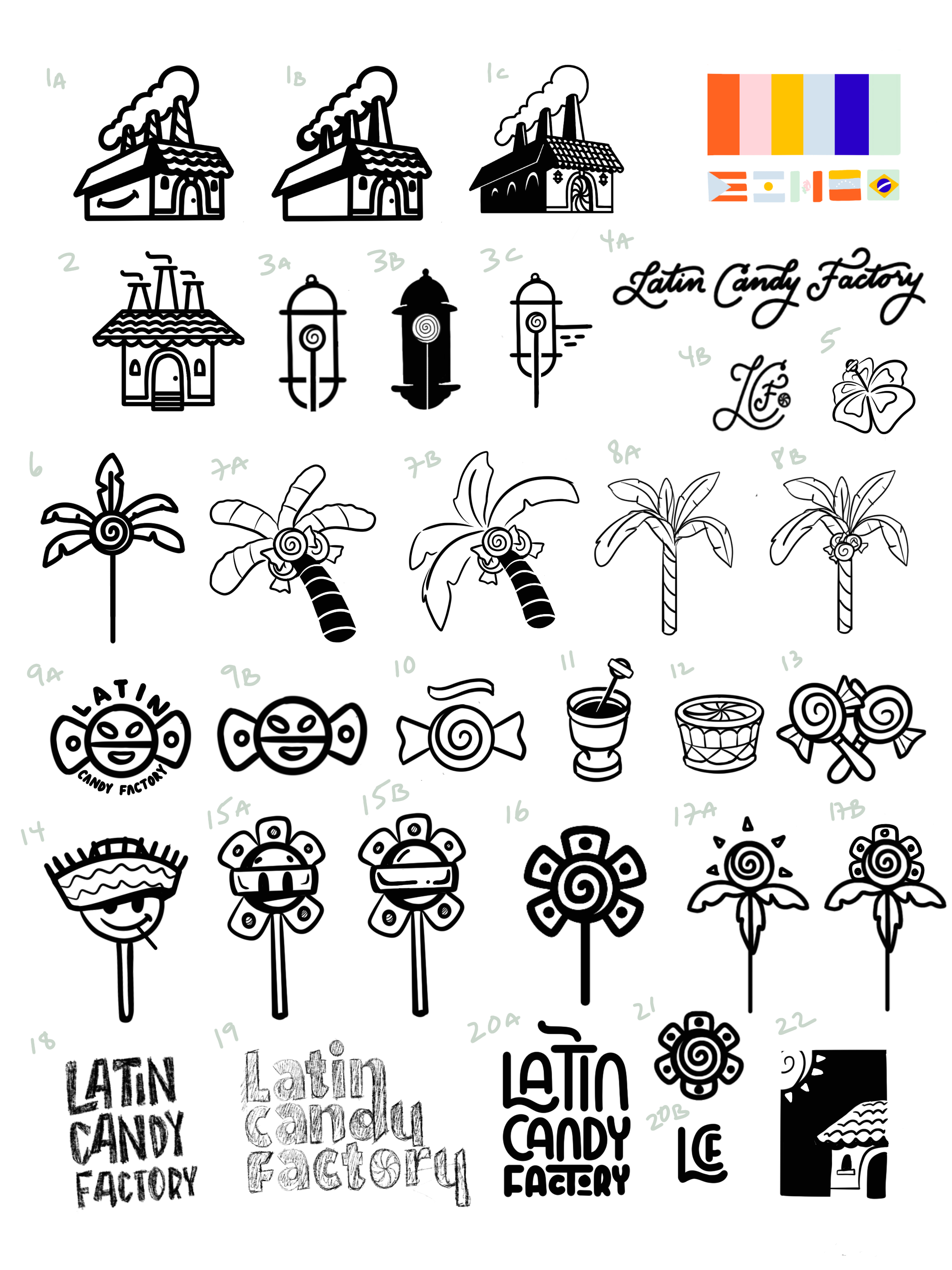
Early drafts of the proposed logo
The Solution
The soul of this brand is in its storytelling — so the design had to lead with heart and heritage. The centerpiece: a custom character logo, smiling and playful, rocking a traditional jíbaro hat (a nod to Puerto Rican farmers and folk culture) with a lollipop in its mouth — a perfect visual mashup of past and present.
The logo can even transform into the head of a lollipop — a clever nod to the product itself and the joy it brings. It’s more than a mark — it’s a mascot, a memory, and a mood.

Jibaro hat
Happy face to exude joy
Enjoying a lollipop
Design Approach
The Jibaro Logo System
The main logo consists of a jibaro hat, a staple of Puerto Rican iconography, playfully sitting asymmetrically on top of a smiley face (symbolic of the joy and excitement of the brand) with a lollipop in its mouth. The logo’s simplicity lends itself to versatility and memorability.


The Sidekick
Taking inspiration from the Taino symbol of the sun (found in caves all throughout the island of Puerto Rico) and the swirl patterns of candy, this secondary logo allows for a memorable and unique logomark with culural elements in homage to the island’s first native people.


Custom Wordmark
This bespoke and customized word mark, inspired by the doorways of Old San Juan, converts the ‘O’ in factory into a delicious lollipop (and connects the ‘N’ in Latin with the ‘Y’ in Candy); allowing the characters of the wordmark to interact with one another an add visual interest.

Typography with Character
Custom typefaces that echo mural lettering and corner-store signage across Latin America; pairing a playful script and bold sans serif typefaces to provide a visually appealing contrast and exchange.

Geometric & Symbolic
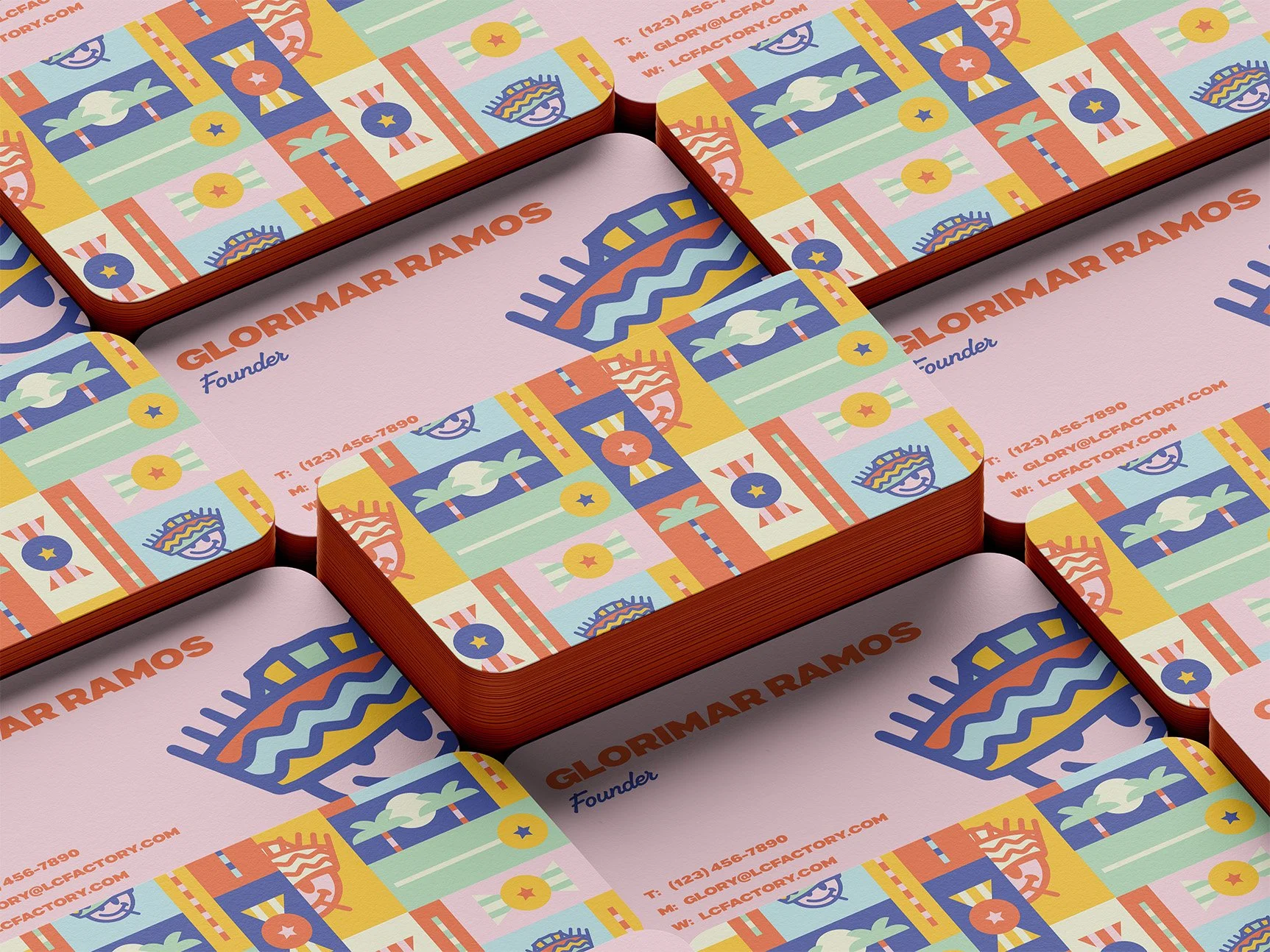
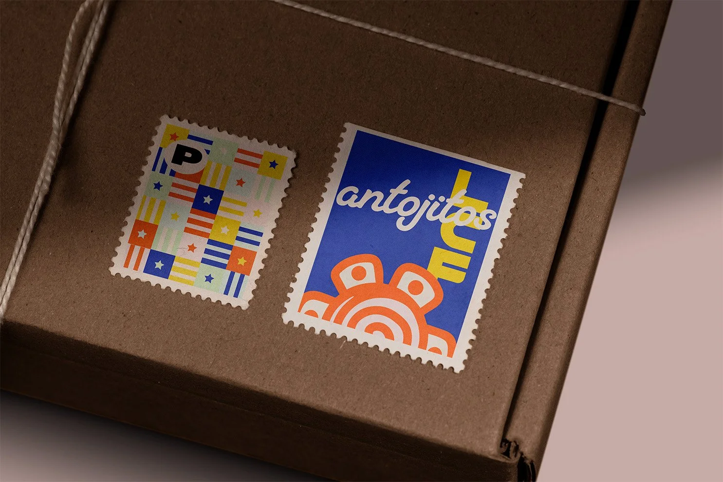
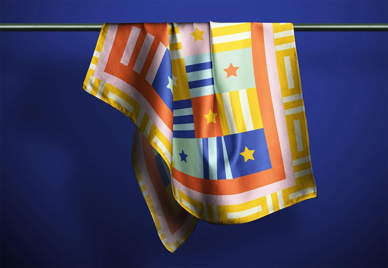
Taking inspiration from the Puerto Rican flag, the brand pattern and language use a lone Star and 6 stripes that nod to the founder’s Puerto Rican roots in a subtle, but meaningful way.
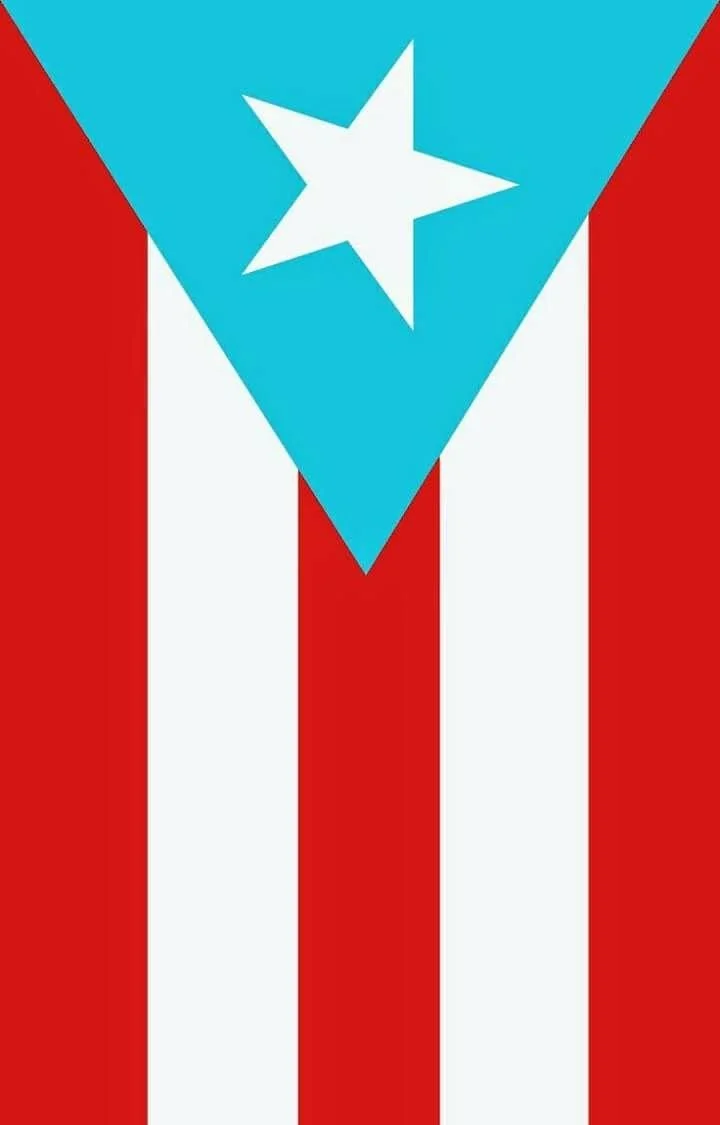

Puerto Rican flag
LCF Brand Pattern
Brand Elements
Consistent with the geometric shapes found in the Puerto Rican flag, LCF’s brand elements tell the story of the brand, from the sweet treats it delivers to the enchanted island in which its story is rooted.



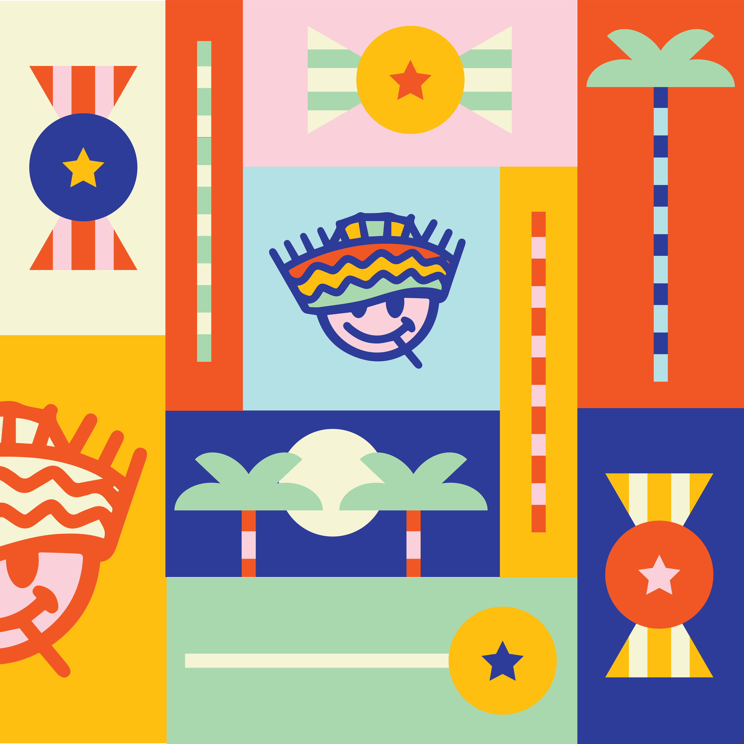
Brand Elements in Action
Fun & Versatile Colorway
A playful, intentionally soft color palette that evokes warmth without being overly bright. Taking inspiration from the color logic of the rings of the Olympics, LCF’s Colors were also chosen intentionally; as they all can be used to create the simplified flags of all of the Latin American countries.


Execution
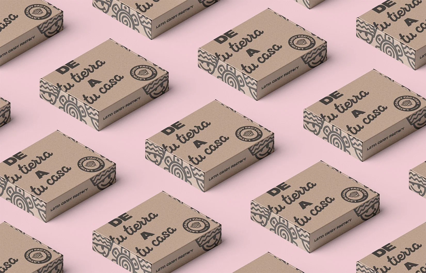
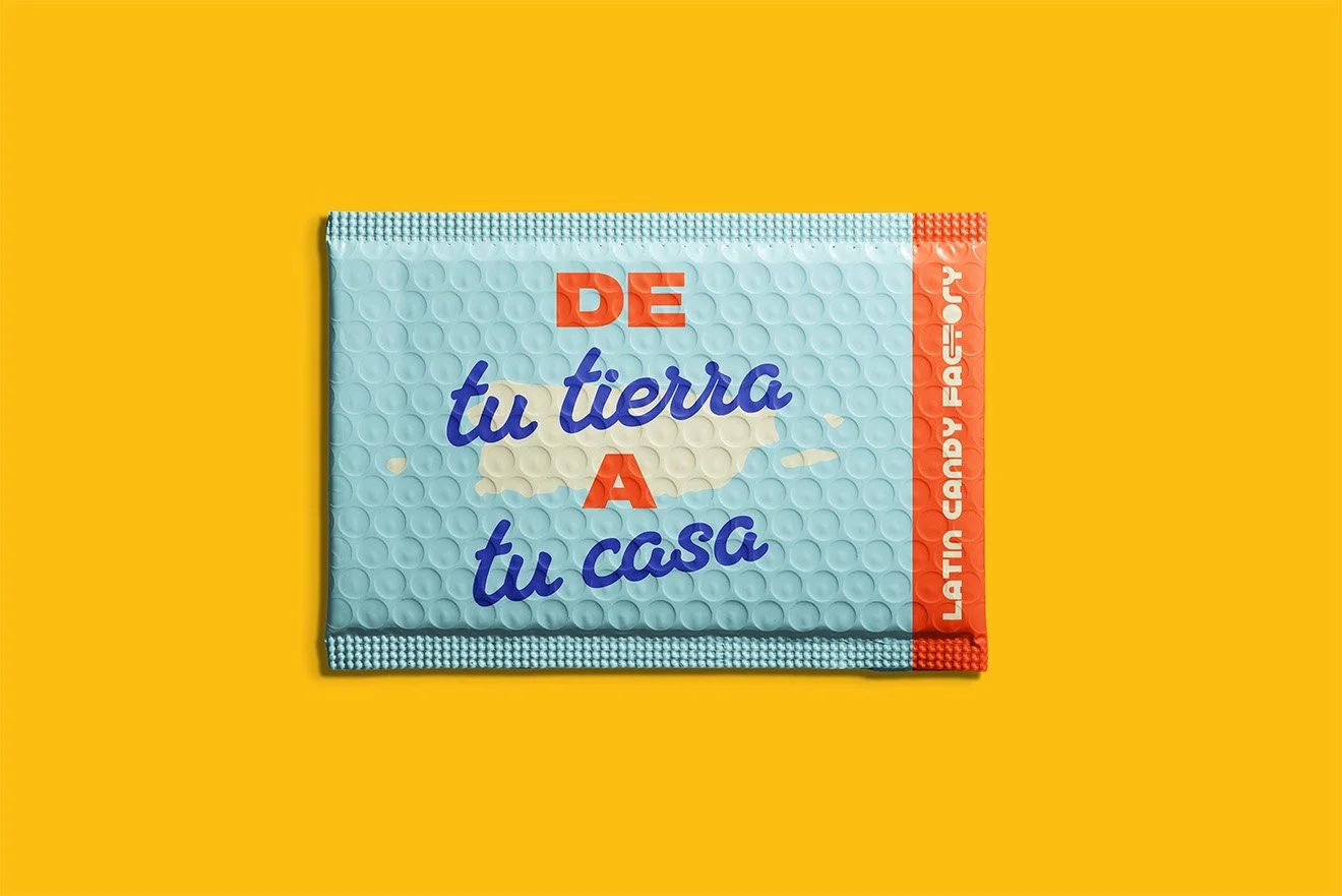
From concept to completion, the brand system was built to flex across all touchpoints — from packaging to social to in-store displays. Deliverables included:
Primary and alternate logos (including the lollipop-head version)
A full custom color palette
Bespoke type family inspired by Latin-American visual culture
A modular, repeatable brand pattern system
A complete brand guideline for consistent rollout
A toolkit of graphic elements, icons, and visual stamps to expand the identity




Impact
What came to life is more than just a candy brand — it’s a visual love letter to Latin-American culture, designed to make people smile, connect, and remember. Latin Candy Factory now has an identity that transcends borders, sparks emotion, and stands out in a crowded market — while staying true to its roots.
It’s candy with culture.
Sweetness with soul.
A brand that feels like home — no matter where you’re from.
“Your work is beautiful and professional!
I really enjoyed working with you!”
- Glorimar R. , founder of Latin Candy Factory

