
ABOVE
Logo & Brand Identity
A case study on elevating mental health branding
The Story
Mental health deserves a visual identity as dynamic and layered as the human experience—but too often, brands in this space rely on the same predictable design tropes. Soft blues, airy fonts, and generic wellness symbols make for a bland and forgettable presence.
Above wanted something different. Above wanted their brand to reflect challenging the norm and expanding the notion of what therapy can be and look like. Inspired by the song “…Lost” by the rapper Andy Mineo, Above wanted their mental health brand to communicate the message that rising above the clouds serves a reminder that the sun remains shining no matter how cloudy the day; assuring the viewer that - no matter how intense the turbulence or how dark the clouds they find themselves in- the constant sunshine above the storm assures that everything is going to be alright.
Like the arrow piercing through the clouds of the song’s cover art, they envisioned a brand that acknowledges the weight of mental struggles while offering a clear path forward—grounded yet uplifting, inspired yet unique, bold yet approachable.
Challenge

Early drafts of the Above logo & design system
How do you capture both struggle and transformation in a single design? How do you create a brand that speaks to the depth of human emotion while still feeling welcoming, fresh, and hopeful?
Goal: To develop a fresh brand identity that doesn’t just blend in—but sparks connection, curiosity, and conversation; using symbols and typography to communicate the tone and vision of the brand.
The Solution
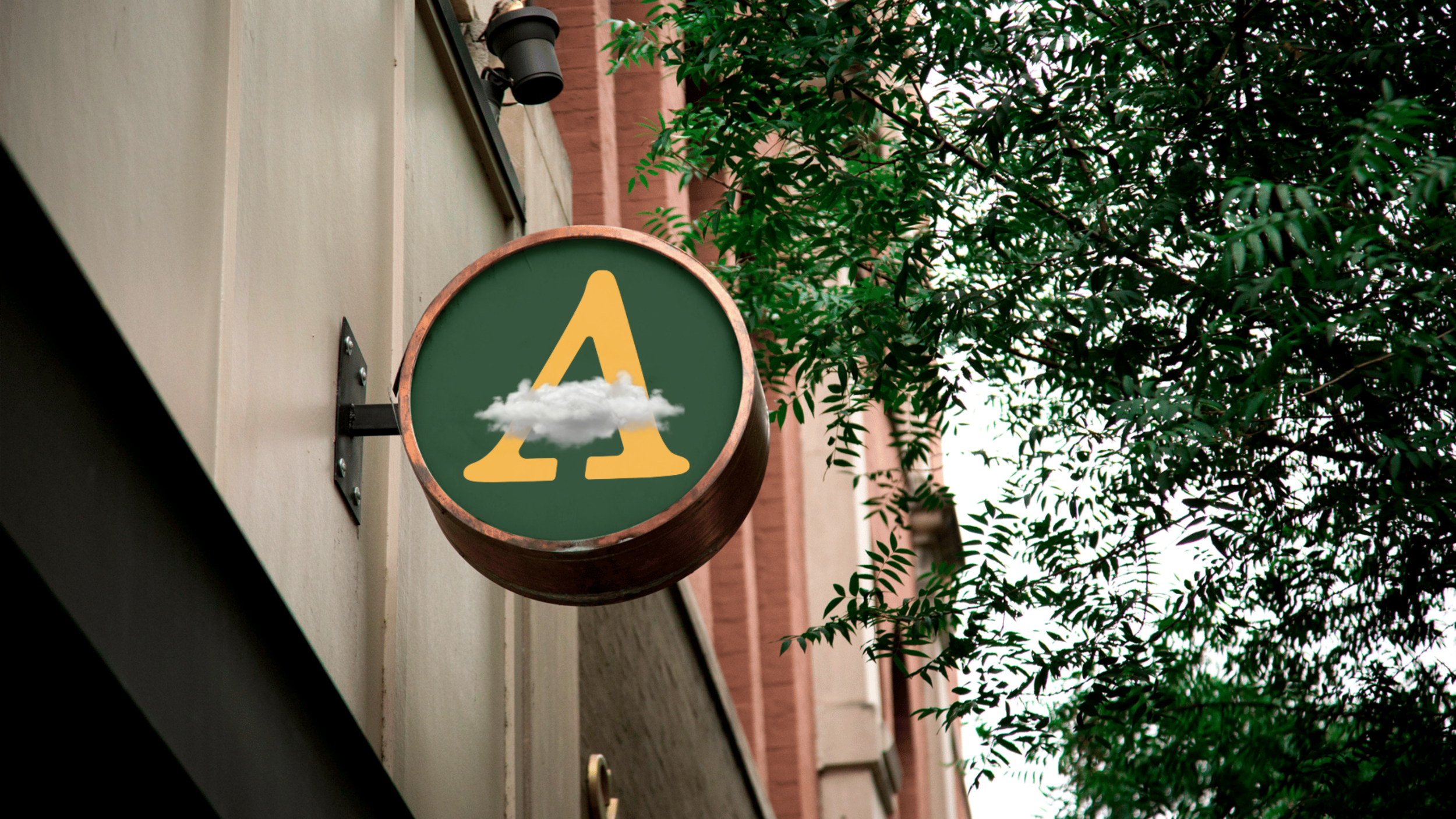
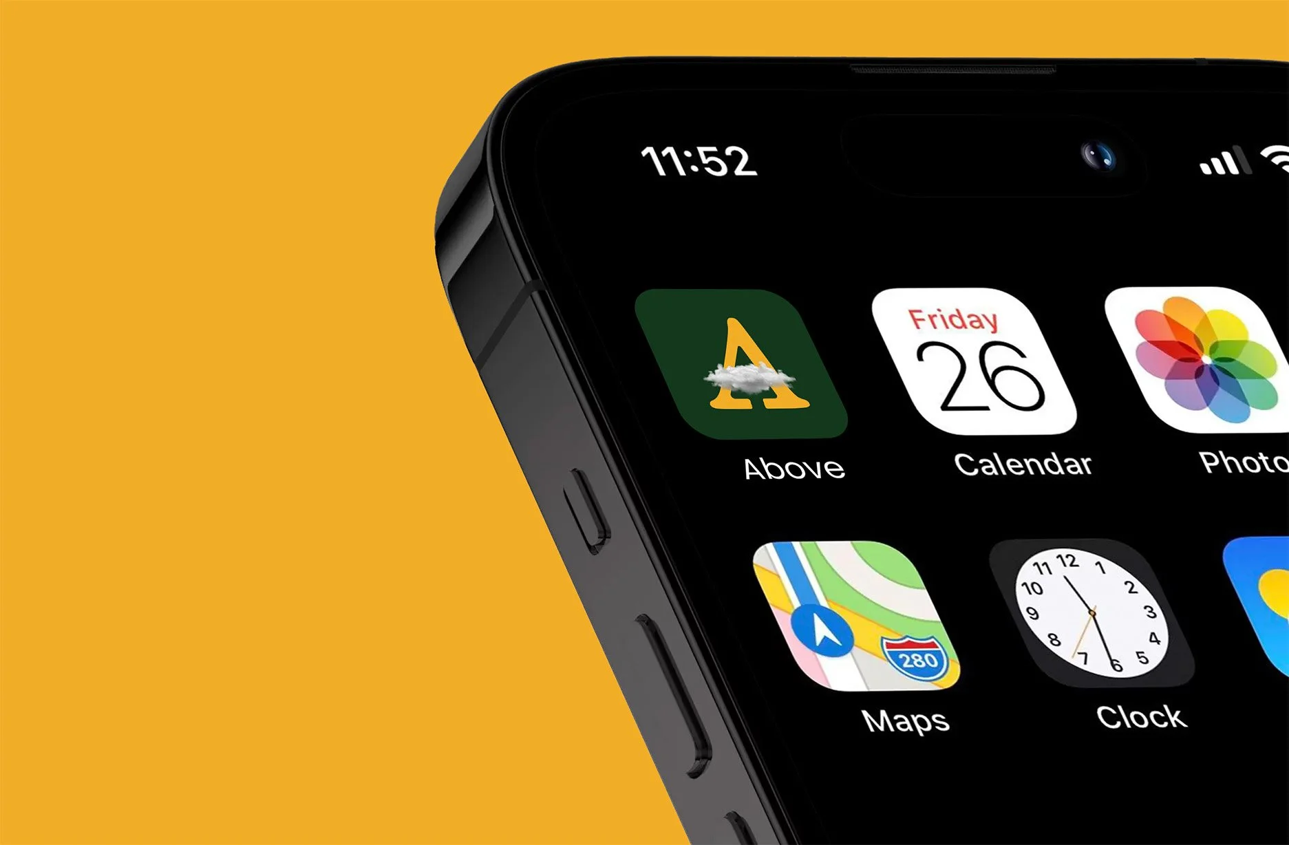
We built the brand identity around two powerful visual metaphors. First, a cloud—a representation of thoughts, emotions, and mental fog that we all experience. But these clouds don’t just linger; they shift, they rise, they transform. Also, an upwards-facing arrow—a representation of direction, resolve, and a path forward; as a nod to the work done in the space of therapy.

Arrow
‘A’
Cloud
Design Approach
Typography With Presence
A bold, modern serif typeface conveys stability, strength, and grounding. It's not just another minimalist font; it stands firm, creating contrast against the fluidity of the cloud elements, while it’s graphic elements also speak to the fresh perspective that sets Above apart from other mental health brands.

Cloud and Arrow Integration
The clouds interact with the typography, representing the complexities of mental health—how emotions can surround and sometimes obscure, but never define. The arrow pierces through the clouds to represent the process of endurance, resilience, and transformation.

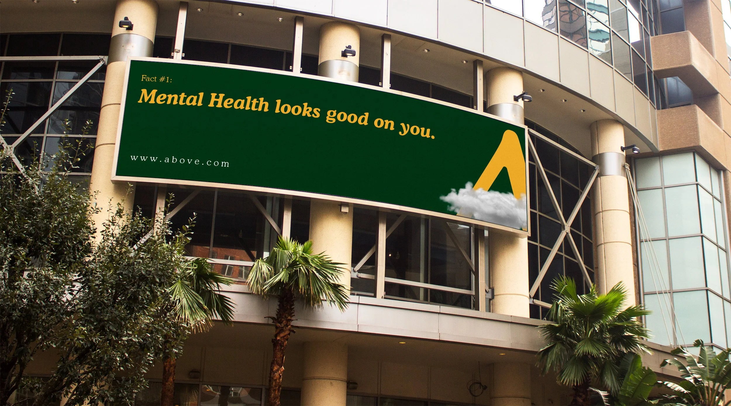
A Fresh Color Story
Instead of typical pastels, we leaned into deep greens and warm neutrals—colors that evoke resilience, growth, and a return to balance. Using colors to intentionally tell the story that inspired the name of the brand, while using color psychology to convey meanings that match the vision of the brand.
We chose a forest green to represent growth and renewal, a warm yellow to represent both the sun shining through and optimism/joy, sky blue to represent both the clear sky after a storm and calm/serenity, as well as a warm grey and white to represent the shifting of clouds and the shift from uncertainty to peace; creating a color scheme that looks visually appealing, presents eye-catching contrast, and has deeper meaning in telling the story that inspired the brand and their mission through the services they provide.
Tension & Contrast

The dynamic interplay between structured letterforms and soft, organic cloud shapes makes the design feel alive, layered, and evolving—just like growth and change in the therapy process and in the human experience.

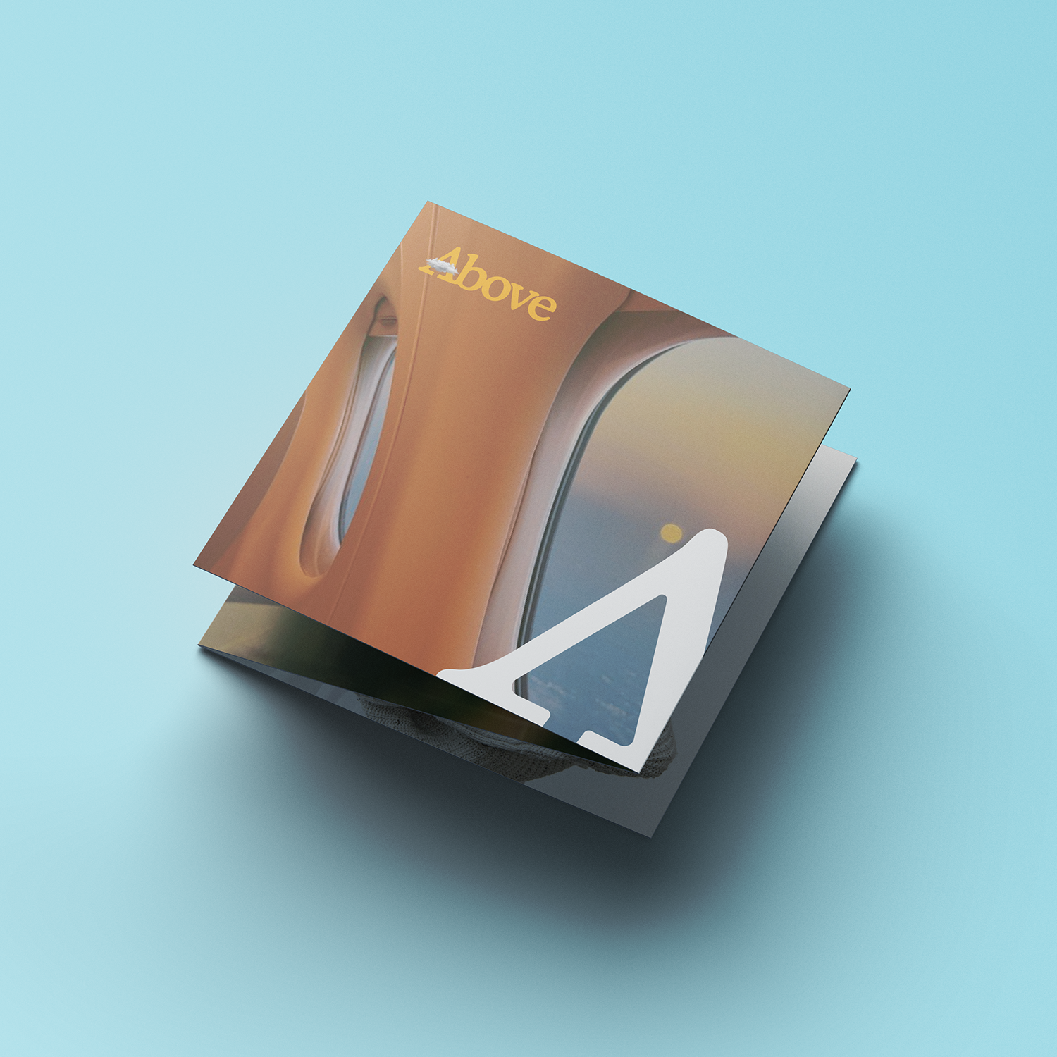
Execution
We didn’t just design a logo; we crafted an experience that extends across all touchpoints:
A logo that evolves with the brand—whether in social media, digital marketing, or print materials, the cloud and typographical elements adapt fluidly and can be used with versatility.
A cohesive visual language—the color palette, typography, and cloud motifs create a recognizable and emotionally resonant brand.
A bold but empathetic tone—Above’s brand identity isn’t just seen; it’s felt.


Impact
With its new identity, Above is no longer just another mental health brand—it’s a movement.
Memorable & Distinct – The unique fusion of typography and cloud imagery creates a standout brand presence.
Emotionally Engaging – It acknowledges the weight of struggle while inspiring movement and transformation.
Strategic & Meaningful – Every element is designed with intention, depth, and a clear message.